9 signs your business has outgrown its website
Check if it's time for a redesign and how to spot that your current site is starting to hold you back.
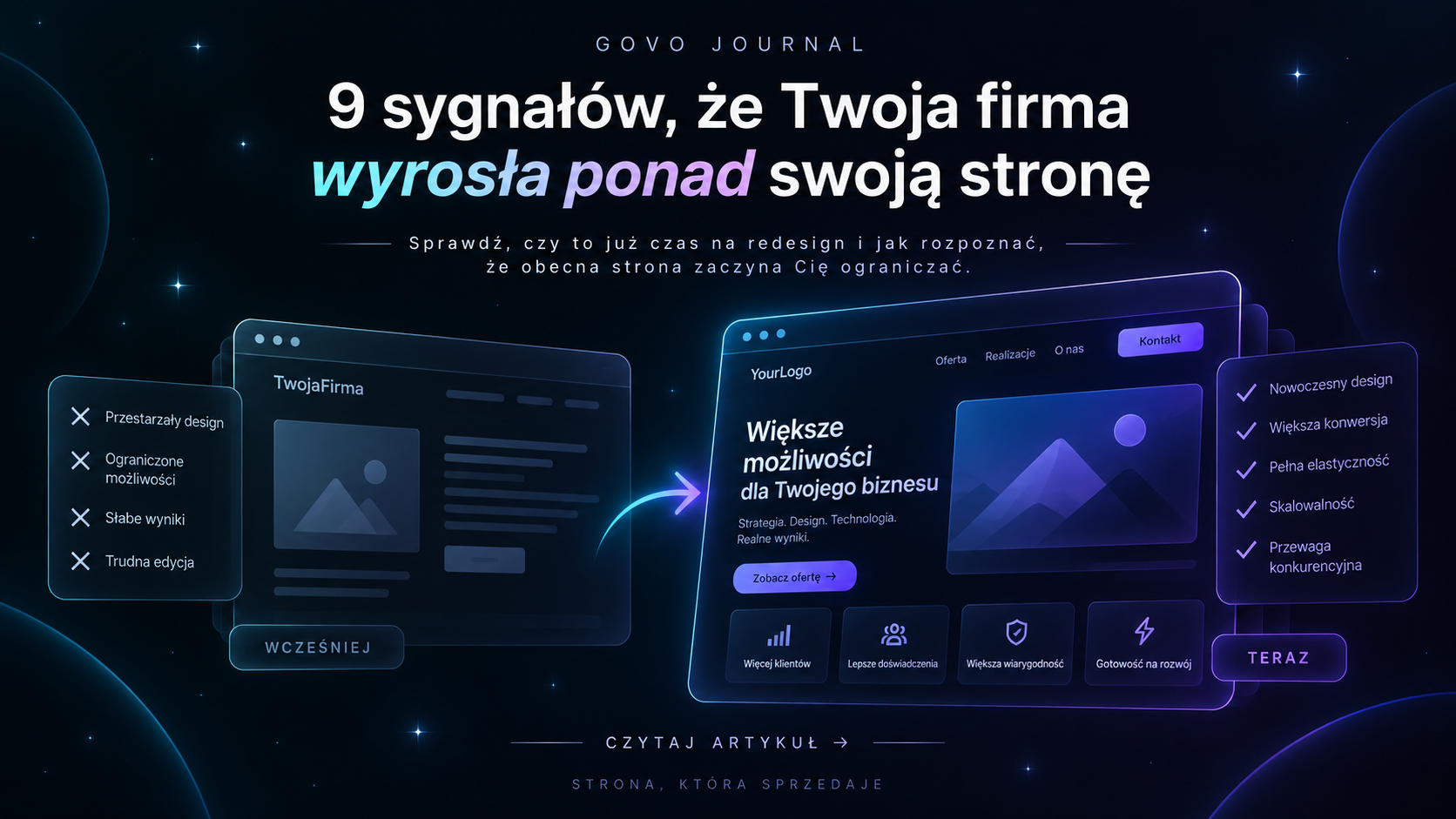
A website rarely grows old overnight. Much more often something else happens: the business moves forward and the site stays behind.
The offer evolves. Photos get better. Social media looks more professional. New clients, projects and services appear.
Only the site still tells the story of the company from a few years ago. And that is when it stops being just „a little old” and starts becoming a problem.
011. You hesitate to send someone a link to your own site
This is one of the simplest tests. A client asks: „Do you have a website?”, and your instinct is to send Instagram, a PDF, Behance or a few WhatsApp photos instead.
If the best way to present your business is anything except its own website, something is wrong. The site should be the place you confidently direct people to. Not a place you have to explain.
022. Your offer looks different today from when the site was built
Businesses change. A new service is added. An old one disappears. The customer group changes. The brand starts handling more expensive projects.
The problem starts when you keep forcing the new offer into a structure designed for the old business. The result? The menu becomes chaotic, sections are added randomly, and the most important things get lost between content that used to matter more.
This is often a sign that what you need is not another subpage, but a new information hierarchy.
033. Instagram looks better than the website
This is especially common in visual industries: detailing, gastronomy, beauty, interiors, real estate, fashion. The company invests in photos, reels and identity. The feed looks modern and premium.
A potential client clicks the link in the bio — and suddenly lands on a site that looks like a completely different brand. That disconnect can undermine the first impression.
Not because every site has to be spectacular. Because the level of presentation should match the level of the company.
044. The site works on mobile, but was not designed for mobile
These are not the same thing. A site can be technically „responsive” and still be hard to use. Buttons too small. Huge blocks of text. Poorly cropped photos. A form that requires constant scrolling. A menu where it is hard to find anything.
If the main version of the site was designed for desktop and mobile was just shrunk down, users notice it quickly. Today mobile is not an add-on. For many clients it will be the first and only contact with your site.
055. The client does not know what to do next
A good website should not end with „looks nice”. It should lead. To an enquiry. A booking. A purchase. Checking past work. Choosing a service.
If a user reads the offer but then has to look for the phone number or guess where to go next, the site is not doing its job. Usually the problem is not a missing button. The problem is a missing clear decision path.
066. Every change on the site is a fight
Changing a price means contacting the person who built the site three years ago. Adding a project breaks the layout. A new service does not fit any existing section. Every next element requires working around the previous one.
This usually means the site was not designed with growth in mind. A good structure does not have to predict the future. But it should let the company grow without rebuilding everything with every change.
077. Clients keep asking about things that should be obvious
„What does working with you look like?”, „How long does it take?”, „Do you also do X?”, „How can I book a date?”. If the same questions keep coming back, the site probably does not answer them clearly enough.
That is valuable information. The best sites often come from analysing real conversations with clients. Because a good website should take some of that work off the business owner.
088. The site no longer supports SEO
Over time, not only the design changes. The way people search for services changes, the competition changes and the content changes. If the site has little content, unclear structure, weak metadata or technical issues, it can be hard to grow its visibility without bigger changes.
A redesign should not mean throwing everything away though. If existing URLs and content generate traffic, they should be kept or properly redirected.
099. Instead of developing the site, you keep working around it
You create a separate Linktree. A separate form. A separate landing page. A PDF offer. A portfolio elsewhere. Each of these tools can make sense on its own.
But if they appear mainly because the main site can no longer hold the current business, the problem runs deeper.
10Does every signal mean a full redesign?
No. Sometimes it is enough to fix the first section, simplify navigation, rebuild the form or polish mobile.
A redesign makes sense when the problems start connecting. Old structure. Outdated image. Difficult editing. Weak mobile version. Chaotic offer. Then fixing individual elements can feel like renovating a room in a building whose layout no longer makes sense.
11So the most important question is not:
„Is my site old?”. It is: „Does it still represent the business I run today?”. If the answer is „no”, your company may indeed have outgrown its website.
Feel like your website is a few steps behind your business? See how I approach redesigns and what is worth keeping instead of rebuilding everything from scratch. Website redesign
Related articles
Want to apply this to your site?
Get in touch about your project — we start with a short call about the goal.
Let's talk