Traffic but no clients? 8 things to check
Lots of visits do not always mean results. See what might be blocking conversion.
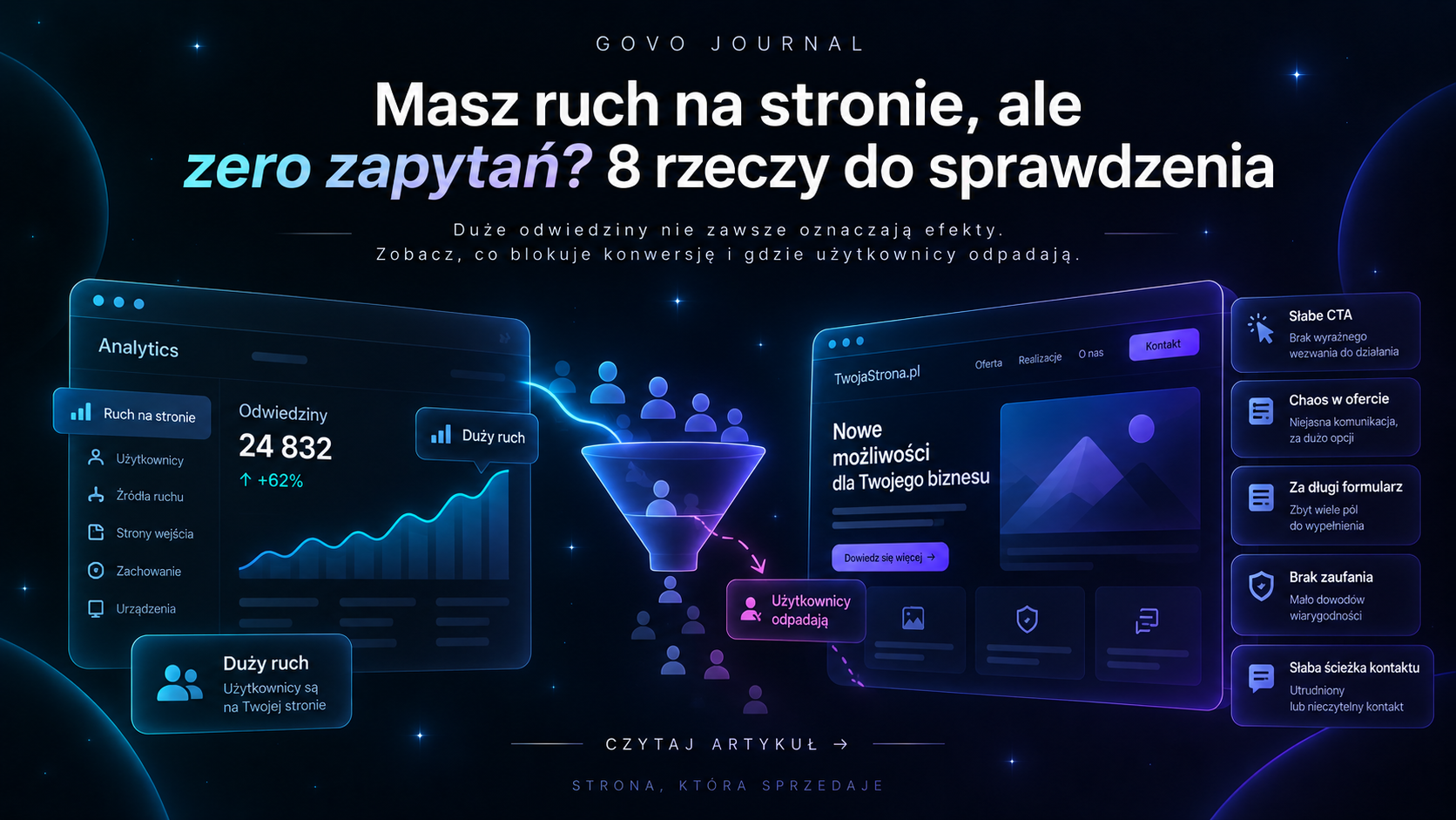
A thousand visits looks good in the analytics panel. But if none of those people write, call or buy, the number alone means little. Traffic is a means, not a goal. So before you spend more on ads or SEO, it is worth checking what happens to the people you have already brought to the site.
011. The wrong people may be landing on the site
More traffic is not always better traffic. An article may get hundreds of visits from a broad informational phrase even though those people have no intention to buy. An ad may be poorly targeted. A viral post may bring curious onlookers, not clients. So the first question is: where do users actually come from? Google? Ads? Instagram? Referrals? And what were they looking for before they landed on the site? If the user's intent does not match the offer, even the best landing page will not convert everyone.
022. The first screen does not clearly say why it is worth staying
Users do not read a website like a book. First they quickly try to answer three questions: "Where am I?", "Is this for me?", "Why should I keep reading?". If the first section answers: "We create future-proof solutions for modern businesses", the answer may look elegant but still say very little. A good hero does not have to describe the whole company. But it should give enough context for the right person to think: "OK, this is exactly what I am looking for."
033. The offer may be too broad or chaotic
The more options, the harder it is to choose. A company offers 17 services. Each described similarly. No information on where to start. The user does not want to analyse your organisation. They want to solve their own problem. That is why a good site should group the offer in a way that helps make a decision. You do not always have to remove services. Sometimes it is enough to change the hierarchy.
044. There are no reasons to trust you
You can write: "high quality", "individual approach", "professional service". The problem is that anyone can write similar sentences. Trust is built with evidence. Case studies. A concrete process. Photos. Reviews. The people behind the company. Examples of results. Clear terms. If the user is to leave their data, call or pay, they must feel that a real, credible business is on the other side.
055. The CTA is invisible or it is unclear what happens after clicking
"Learn more". "Check it". "Click here". Such buttons do not tell the user very much. A better call to action answers the question: "What will I get after clicking?". "Request a quote." "Book a consultation." "Check available dates." "See case studies." The CTA also has to appear at the right moment. Not just once at the bottom of the page, which half of visitors never reach.
066. The form creates too much friction
The bigger the decision, the more information you can reasonably ask for. But if the first contact requires: first name, last name, company, phone, email, budget, deadline, number of employees and eight extra fields — some people will simply give up. The first form does not have to collect the whole project documentation. It should start a conversation. Every extra field should have a concrete reason to exist.
077. Mobile ruins an experience desktop does not reveal
You can look at your own site every day on a 27-inch monitor and not notice a problem that affects most visitors. On a phone: the CTA may be off-screen, the text too small, the form awkward, the menu overloaded and the images heavy. So when analysing a lack of enquiries, do not just ask: "Does the site work?". Check what it is really like to use it one-handed on a phone.
088. You may simply be measuring wrong
This is especially common. The panel shows traffic. But it does not track: phone clicks, form submissions, mailto opens, project opens, bookings or moves to an external platform. As a result, the site may be generating activity you cannot see. Or the opposite: you count a "Send" click as a conversion even when the form returned an error. Good analytics should answer a concrete question: what did the user do after landing?
09Where to start
Do not change the whole site at once. First trace the user journey: traffic source → first page → offer → CTA → form → submission. Find the place where the most people drop off. If the traffic is wrong, fix the marketing. If users leave immediately, check the message and quality of the first screen. If they read the offer but do not click the CTA, the problem may be value or path. If they open the form but do not complete it, simplify contact. Only then invest in more traffic. Because increasing visits to a site that does not convert is like pouring more water into a leaky bucket.
Do you have a site that gets traffic but no enquiries? It does not always need a full redesign. Sometimes it is enough to find where users drop off and fix exactly that part. Get in touch
Want to apply this to your site?
Get in touch about your project — we start with a short call about the goal.
Let's talk